Microsoft design strikes again
Microsoft design team strikes again. These screenshots from their enterprise tools showcase fundamental design system failures that would make any designer cringe. Let’s analyze what went wrong and how to avoid these mistakes.
The Breakdown: What’s Wrong Here
1. Inconsistent Component Heights
Look at those form fields—each one seems to have decided its own height. This isn’t just aesthetically painful; it breaks the fundamental principle of visual rhythm. When elements don’t align to a consistent grid, users subconsciously feel that something is “off.”
The fix: Establish a base unit (usually 8px) and ensure all components are multiples of this unit.
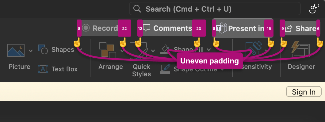
2. Padding Chaos
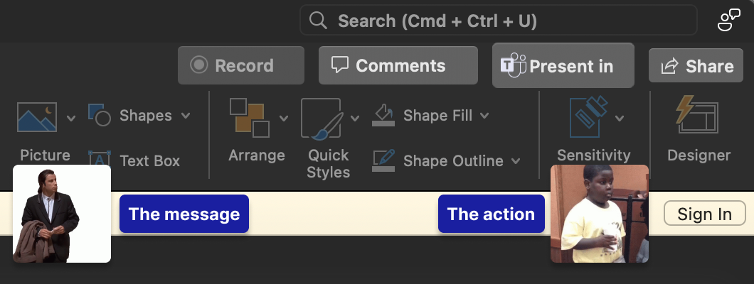
The padding between elements looks like it was determined by a random number generator. Some elements are cramped, others have oceans of space. This destroys visual hierarchy and makes the interface feel unbalanced.
The fix: Define consistent spacing tokens (4px, 8px, 16px, 24px, etc.) and use them religiously.
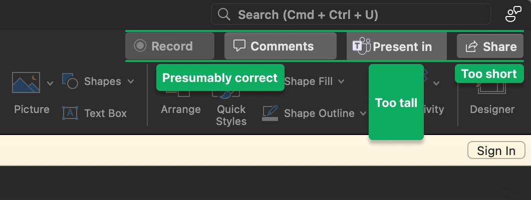
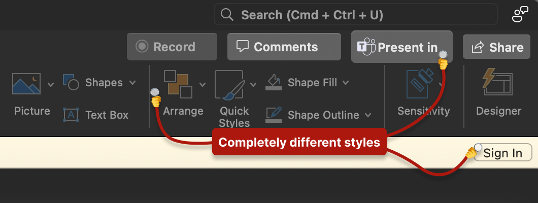
3. Button Style Buffet
We’ve got what appears to be at least three different button treatments in the same view. Primary, secondary, tertiary? No—just confusion. This forces users to decode which actions are important rather than intuitively understanding hierarchy.
The fix: Limit button variations to 3-4 well-defined types with clear use cases.
4. Label-Control Relationships
The spacing between labels and their associated controls is inconsistent, making it unclear which label belongs to which input. This is accessibility 101, folks.
The fix: Labels should be closer to their controls than to other elements (law of proximity).
Why This Happens in Enterprise
This isn’t random incompetence. Enterprise design fails for systemic reasons:
Legacy accumulation: Different teams add features over years without coordination
Design system immaturity: No central authority enforcing consistency
Engineering-led UI: Developers making visual decisions without design input
Acquisition integration: Bolting together products from different companies
“Good enough” culture: Shipping functionality over experience
Lessons for Your Design System
1. Document Everything
If it’s not documented, it doesn’t exist. Every spacing value, every color, every component state needs to be in your design system.
2. Enforce Through Code
Design systems fail when they’re just Figma files. Build your system into your component library so developers can’t accidentally break it.
3. Regular Audits
Schedule quarterly “consistency audits” where you screenshot your entire product and look for drift. Fix it before it compounds.
4. Empower Developers
Most developers want to build good UIs—they just need the tools. Provide clear tokens, components, and examples.
5. Make the Right Thing Easy
If using the design system is harder than not using it, people won’t use it. Your components should be the path of least resistance.
The Real Cost
This isn’t just about aesthetics. Inconsistent UI:
- Increases cognitive load
- Reduces trust in the product
- Slows down development (every element is custom)
- Makes onboarding harder
- Leads to more support tickets
Microsoft has the resources to fix this. The question is whether they have the will.
Key Takeaways
Consistency is a feature—Users shouldn’t have to relearn your UI on every screen
Design systems are insurance—Pay the premium upfront or pay the claims forever
Details matter at scale—Small inconsistencies multiply into big problems
When you see UI this broken from a company Microsoft’s size, it’s not a design problem—it’s an organizational problem. Fix the system, not just the symptoms.